Is your About page even about you?
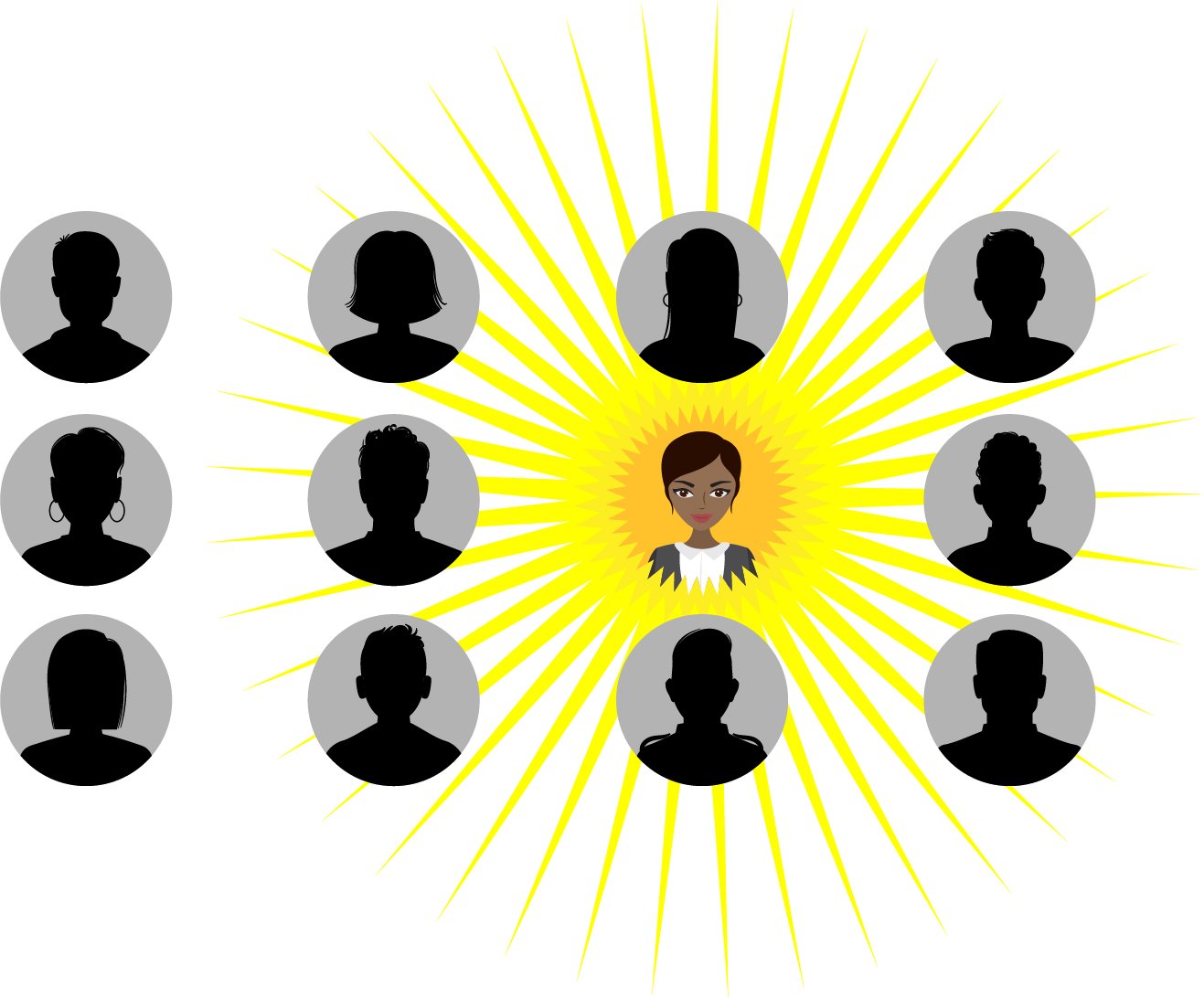
A nameless, faceless organisation doesn’t lack just identity, it lacks credibility. Images from Shutterstock; illustration by Rishad Patel
It isn’t just journalism that’s dealing with trust issues. It’s news organisations themselves. A good way to rebuild that trust is to start with your website.
Let's talk about your About page.
If your website’s About us page doesn’t have very much about you, I’m going to have a problem trusting you. Or reading your news pages. Or wanting to apply for a job to work with you or hire you or fund you.
Chances are, so will your other users.
A typical user journey on the web, especially for a media or news website, begins when they land on your article or story page from either search, social, or a newsletter. They will often then move on to another story, depending on how well your Related Story feature is set up, make their way to your Home page, and then, almost unfailingly, to your About page.
Your About page is a massive opportunity for you to begin a conversation with the people who find their way to your website. This is where you welcome them, thank them for coming, introduce yourself, give them a chance to introduce themselves. You can also then show them around, and make them comfortable. Tell them why you do what you do, and what makes you unlike anybody else.
Let’s make this work for you. A good way to start doing that is by asking a simple question: what is it that people expect from your About page?
Here’s a quick list.
I want to know why you exist. What problem are you solving?
A great way of framing this is to tell your user what problem you’re solving, and for who.
“Bangkok’s local magazines and current affairs websites are geared to English-speaking tourists, but there isn’t a single source that can tell locals and residents about where to find news, purpose, meaning, and community in their beautiful city. We decided to be that source, that friend, that guide.”
I want to know your mission.
The number of About us pages I see that traffic in templated ambiguity around ‘telling untold stories’ and ‘being a voice for the voiceless’ and ‘storytelling with purpose for solutions and people by award-winning journalism for society and democracy’ is staggering. These are all noble pursuits, but when you already have your user’s attention, why waste it on stock generalities? It would probably be more useful and effective for your community and audiences if you were to stay away from the jargon and tap into what drives you — and them.
What change do you want to bring about? How does that tie into their life? And how can you do this thing together?
I want to know who you people are.
The number of About us pages on the web without a single name or face of anybody who works there is alarming. A nameless, faceless organisation doesn’t lack just identity, it lacks credibility.
Who are you folks? What are your names? What do you look like? Where are you from? And what do you do?
Showing people — especially your audiences, collaborators, clients, advertisers, and funders — who you really are is powerful, because it puts names and faces to your mission. It makes you answerable and shows responsibility. It begins a conversation between two human beings, not corporations (because “Silence, brand.”). And it makes you human.
Think of the beginning of that conversation with your user. You’d probably want to address a number of things when you first introduce yourself to someone. When were you founded? Where are you based? Do you speak other languages? How long have you been doing this? And who is this for?
I want to know if other people trust you.
Here's your chance to brag a little. Stick an endorsement of your work in here by other people — put it in quotes, make it bold, attribute it, and show it off. Social proof is a powerful signal of trust.
I want to know what I can do here.
What do you want your users to do on your website? Do you have products and services? Should they only read your articles? Or maybe support this cause? Subscribe to your newsletters? Follow you on Twitter? Join your membership program? Attend your events? Buy your t-shirt? Answer your survey? Comment on your articles? Listen to your podcast? Meet other users? Advertise on your website? Sponsor a show? Apply for a job? Commission you to do research? Subscribe to your research reports? Attend a workshop? Join a community?
At Splice, we sometimes call this ‘the menu problem’: if you don’t show me your menu, I don’t know what to order.
Another way of framing this is to make it clear to all your different kinds of users what you have for them, based on what they might find useful.
I want to know how you make your money.
Why should you tell your user this? Because you want her to trust you, and a great way to do this to be transparent about your sources of funding.
Sometimes this could just be a brief statement: “We make money selling advertising space to companies on our website and Instagram. We have a paid newsletter. And we apply for grant funding from organisations like Luminate and the Bill and Melinda Gates Foundation.”
Or you could go all the way and open your financials to everybody the way Tanmoy Goswami of Sanity by Tanmoy does.
I want to tell other people about you.
How shareable is your website? Does it have easy ways for your user to share all your media like stories, audio, and video? Is there a quick and socially shareable way for a user to encourage her friends and networks to read you or follow you or support you or subscribe to you or join you or fund you?
Make this simple to do, and start with your About page. It’s a great way of having your users recruit other users for you because they love your values.
I want to support you.
We recently did a rebranding and audience study for the wonderful Puma Podcast in the Philippines. It involved working with them to study and have conversations with their audiences around their perceptions about the Puma brand, the shows, and how they wanted to be involved. One listener comment stuck out — and was echoed by other people in the conversations we had — and it went as follows: “Make it easy to take my money”.
Sometimes it can be simple. Use your About us page to clarify your mission and tell your user how they can support it. A call to action button — like Donate or Join — can seal the deal. It's a great way to have your user join you on your newsroom's journey. Shared purpose is a powerful way to build community.
Making this overt and easy to understand on your About page also allows you to make your ask clear to funders and grantors who are looking for impact with their budgets.
I want to meet other people like me.
If you’re addressing one person’s problem, that’s a great way to find your mission. But if you let them know they’re not alone with that problem, you have community — a shared mission. And the point of a community isn’t to market them products or sell to them; the point is for them to find each other.
As a media organisation, you have the power to be able to do this for people — to convene them and help them solve problems together. Show them ways to meet, work, and grow together.
I want to get in touch with you.
Yes, of course you can have your website visitor contact you by filling in a form on your contact page, but think about it this way: what’s the point of sticking your picture, name, bio, and social profile there if you’re not going to give her a way to contact you? Add your email address — and respond to emails.
The same goes for newsletters, by the way. It’s 2022. Please stop sending impersonal newsletters from your company without signing off as an actual person — unless it’s a quick automated purchase confirmation or something similar. Have a real person send the email, just like you would with regular email.
Also, email is a one to one conversation, so no matter how many people you’re sending to, it’s usually only one person reading it.
Don’t forget that, as a media org, you’re often also a convener of people, so conversation may also include giving your audiences ways to get in touch with each other. Do you have a Telegram, Discord, or Slack channel they can meet on? Or even just a Facebook or WhatsApp group? Pop it on the About page.
Finally, this wildly underrated page is also a great place to let your website users give you feedback about your website or stories. Are there broken links? Is something not working? Do they have feature requests? This is where you give them that email address or simple form. Keep that conversation going.
It’s your About page. Why not make it about you?

